How Research, Strategy, and Data-Driven Design Transformed Legal Education
Overview
At the forefront of educational innovation, Wolters Kluwer wanted to create Connected Casebook, a groundbreaking digital platform designed to revolutionize how law students engage with casebooks. This initiative marks a pivotal shift from traditional to digital learning, offering an enriched, interactive experience across desktop, laptop, and tablet devices. Our mission was to address the evolving needs of today's law students and faculty by providing three core components: an advanced e-reader, a dynamic outline tool, and comprehensive study tools.
The project embarked on overcoming industry challenges, notably the conceptualization and implementation of a unique feature set that would distinguish the Connected Casebook in the online education market. Through rigorous user research, iterative design processes, and innovative problem-solving, we successfully transformed the academic landscape for law students, enhancing their learning efficiency and engagement. The Connected Casebook has set a new standard in legal education, backed by positive feedback from the community and a clear path toward continued success in the educational technology space.
Problem Statement
Wolters Kluwer’s competitors already had online offerings. Wolters Kluwer wanted to be the gold standard for the online casebook market as they were with printed casebooks. Wolters Kluwer’s opportunity was to redefine online casebooks by introducing tools that drastically reduce cognitive load, improve efficiency, and enhance learning outcomes.
Challenges
Upon joining the project, the biggest challenge I faced was overcoming the team's strong belief in a "concept tree"—a visual map of all major legal concepts in a casebook. Project leaders saw it as a game-changing feature that could outshine competitors, replace navigation, and even eliminate search.
However, the idea had significant flaws:
- No one knew how many concepts were in a typical casebook.
- No one knew what the concept tree might look like.
- No one had yet thought through how the concept tree would function as a means of navigation.
The project team liked how visualthesaurus.com displayed relationships between words using a labeled interactive force-directed graph, as shown in the example below.
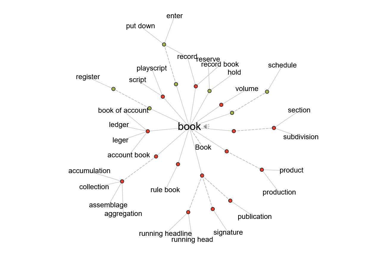
Sample of graph from visualthesaurus.com
To assess the feasibility of the concept tree, I asked a subject matter expert to estimate the number of concepts in a typical casebook. The results were staggering—each casebook contained at least 75 primary concepts, each with two sub-levels.

Visualizing this in a dynamic graph quickly revealed its flaws. A dense web of interconnected terms would be overwhelming, making navigation impractical and relationships challenging to decipher. After exploring multiple visualization methods, it became clear: the concept tree was too complex to be usable.
A new approach was needed. Fortunately, user research led us to a breakthrough.
Audience & Key Insight
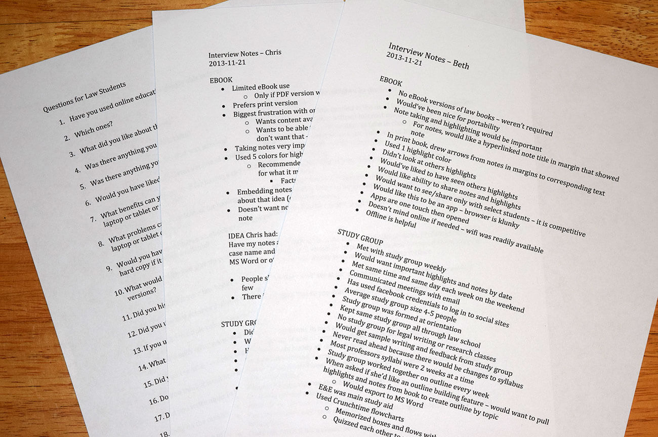
We conducted in-depth interviews with law students and recent graduates to uncover their biggest challenges. One insight stood out immediately: students’ biggest struggle wasn’t concept organization—outlining casebooks was painfully time-consuming. Students highlighted passages and scribbled notes in the margins of casebooks, and later, they spent weeks manually transcribing everything into Microsoft Word.
This presented a game-changing opportunity. What if we automated the outlining process?
Since we were already developing an e-reader with highlighting capabilities, we could take it further:
- Allow students to attach notes to highlights
- Automatically generate an outline based on their highlights and notes using the casebook’s structure
- Eliminate hours of manual transcription
By integrating this feature, we could save students 40+ hours of effort per semester—turning a tedious process into a seamless experience.
Design Process
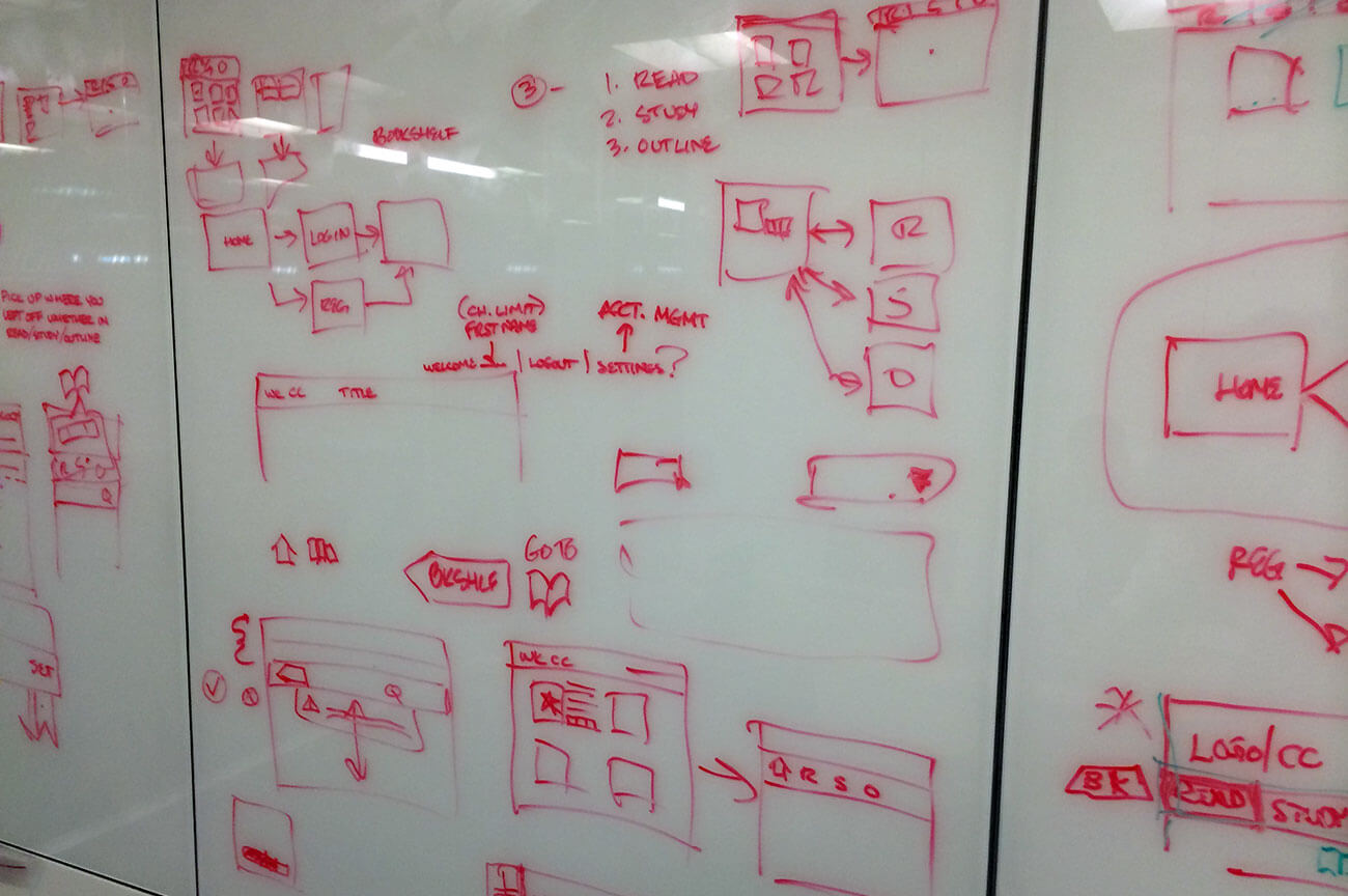
I led a team of 4 interaction designers over ten weeks through the Discovery and Design phases. We started by performing a competitive analysis and did a tremendous amount of whiteboarding to create personas, user stories, an in-depth task analysis, and a site map. Then, we created wireframes for the three main areas of the product.
E-Reader
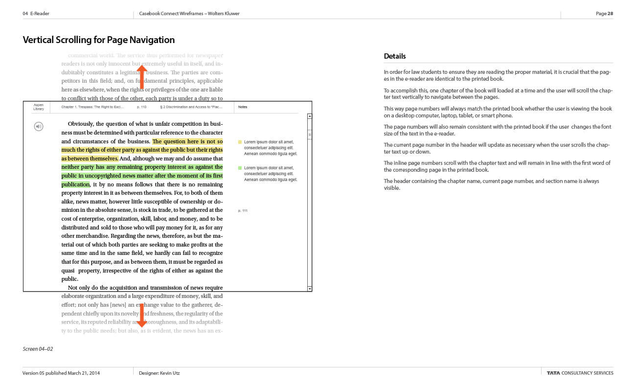
The casebook e-reader needed to allow standard features such as changing font sizes and viewing the book on a tablet in portrait or landscape mode. The challenge with this e-reader was that professors assigned course reading by page number, so the page numbers on the e-reader needed to match the page numbers in the printed books no matter what device you were using. We accomplished this by displaying one chapter at a time and having the chapter content scroll vertically.
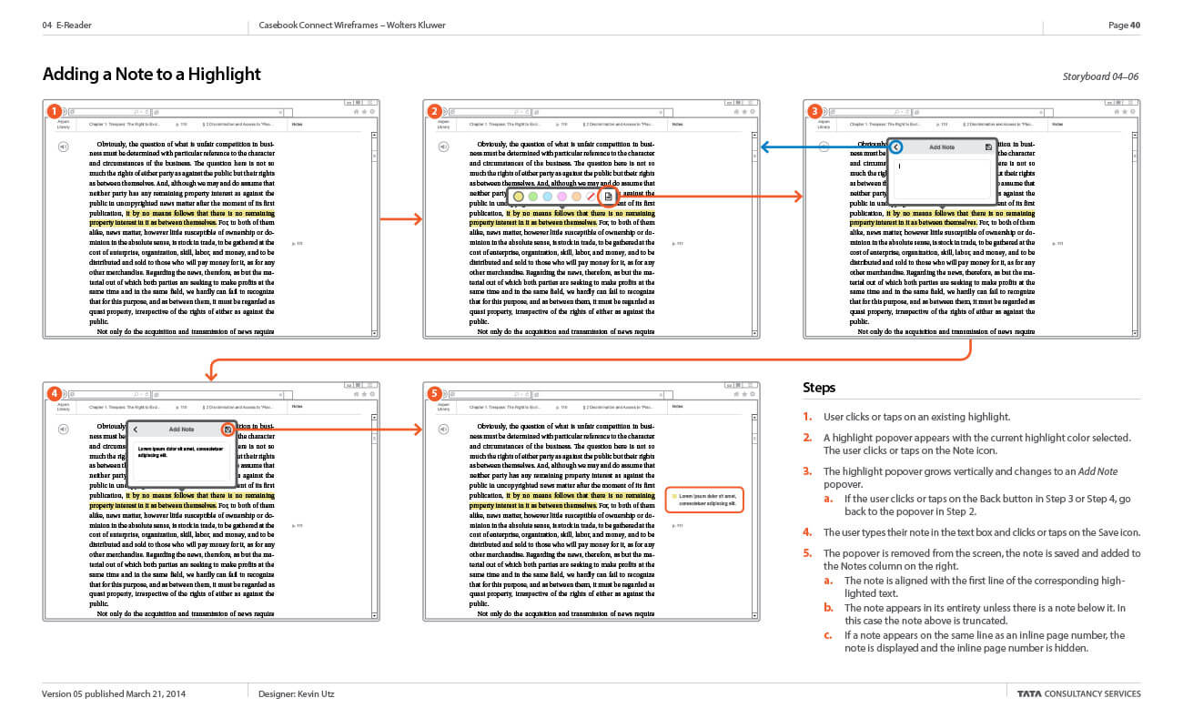
During the interviews, we learned students use 1 to 5 colors to highlight their casebooks. When students used multiple colors, they assigned categories to each color. We provided six colors for highlighting and the option to assign a label or category to each color. Users can make notes in the page margin or link to a highlighted passage. The online experience would mirror how the students used the printed books.
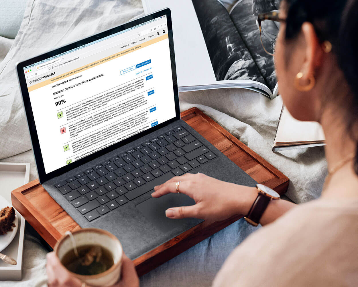
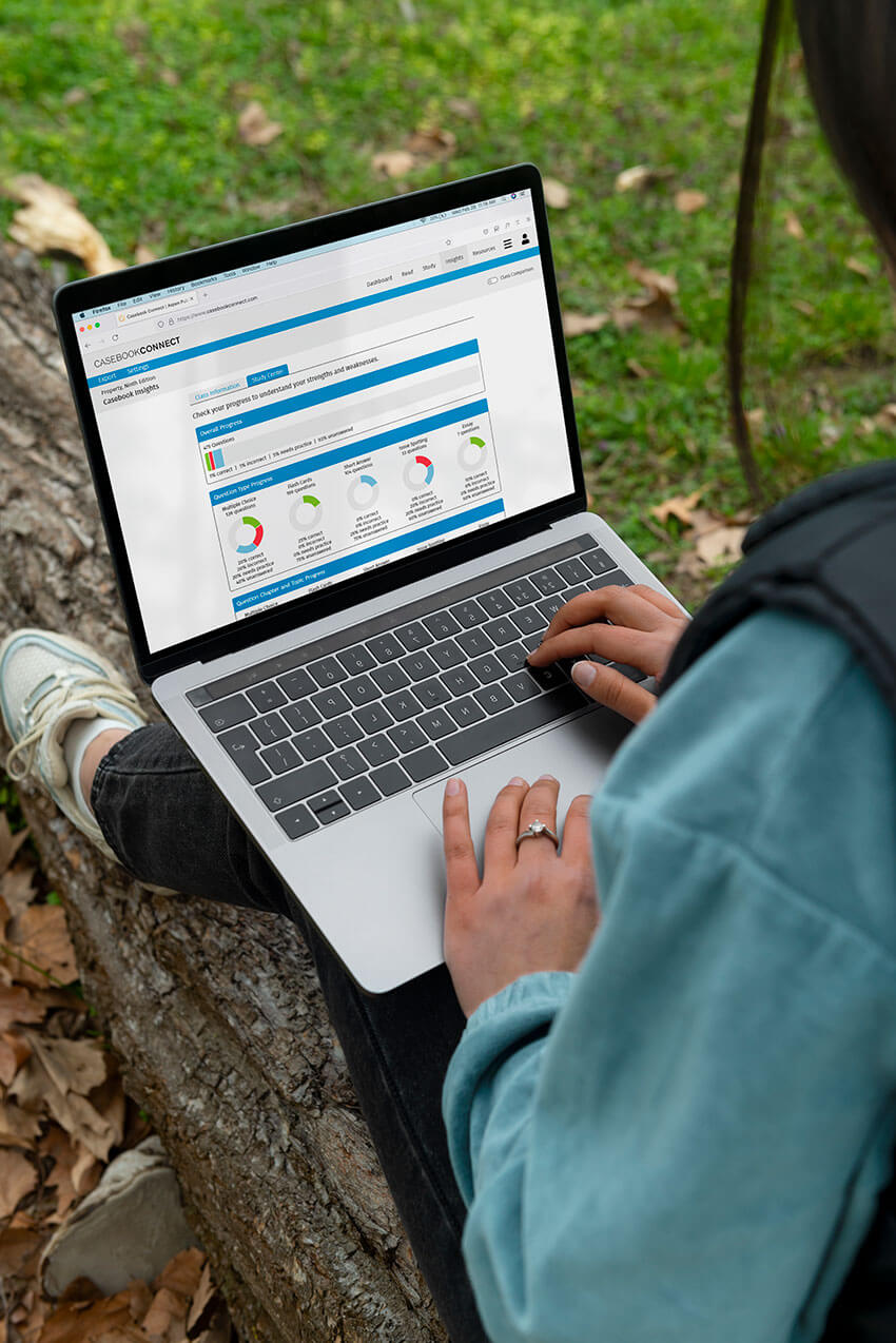
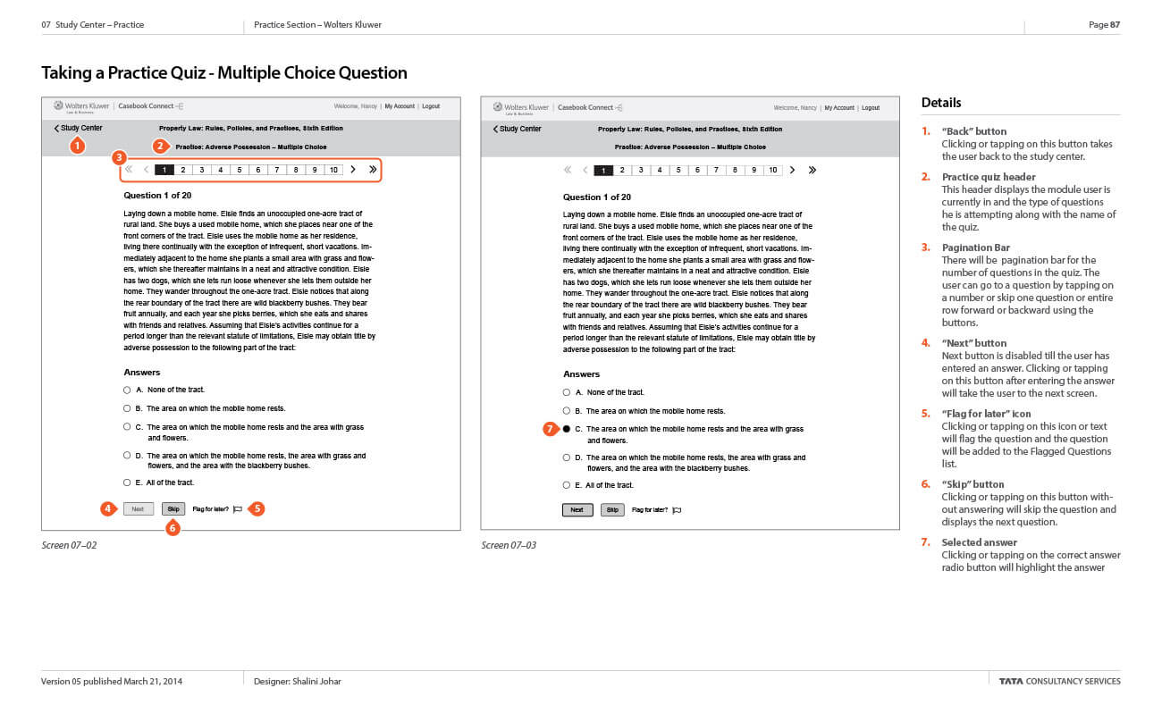
Study Center
Wolters Kluwer already offered a robust set of study tools; the challenge would be putting them online in a cohesive fashion, allowing students to check their progress and mastery of the material. We created a desktop for the study center that showed all of the learning aids that were available for a casebook and the student's mastery of each learning objective with continual feedback showing a student's strengths and weaknesses by activity, topic, and chapter.
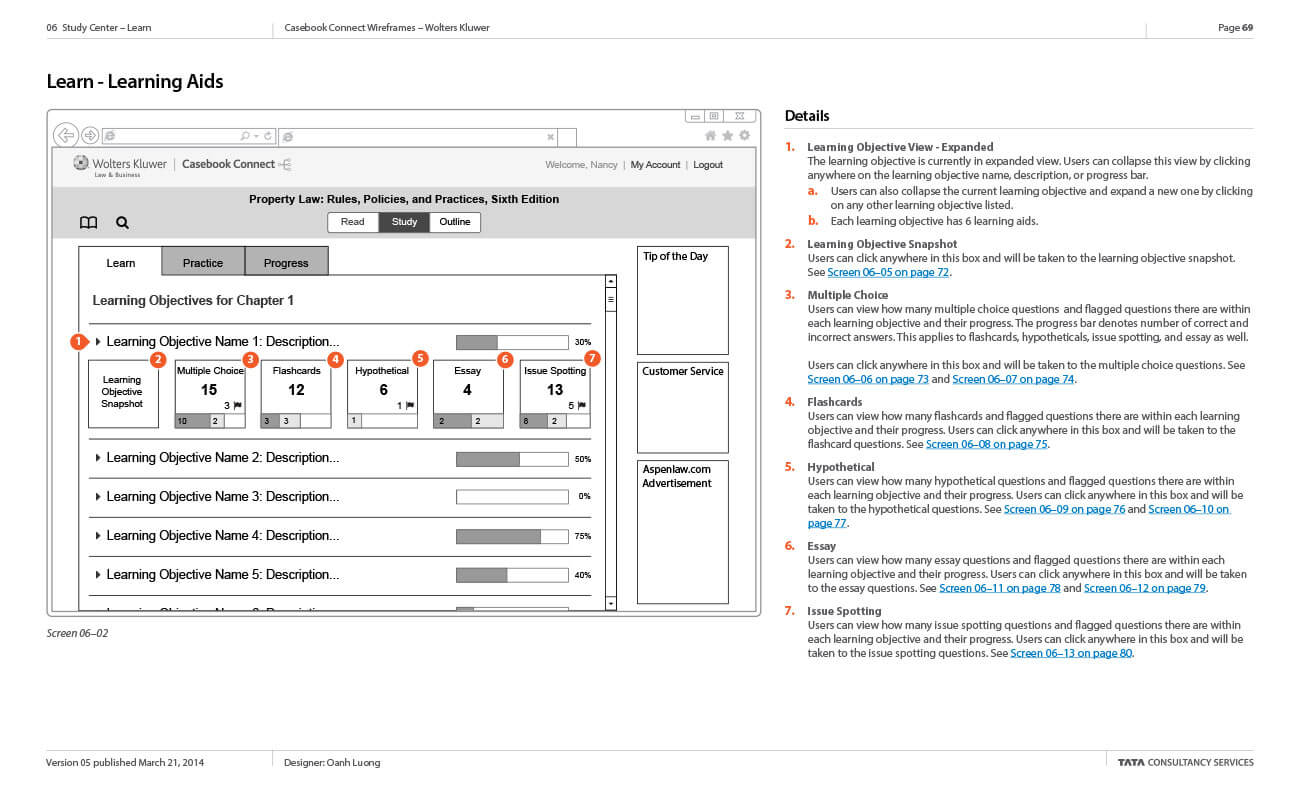
The study center includes flashcards, multiple-choice questions, hypothetical short-answer questions, essay questions, and issue-spotting exercises. The exercise types are very different, but we were able to design layouts to optimize the user experience for each question type while still making them feel like a cohesive unit. Students can even flag individual questions to revisit later.
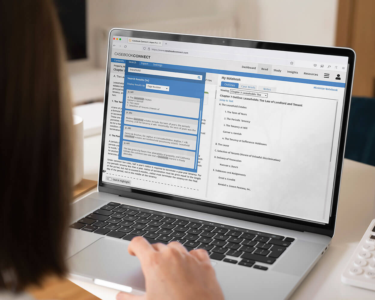
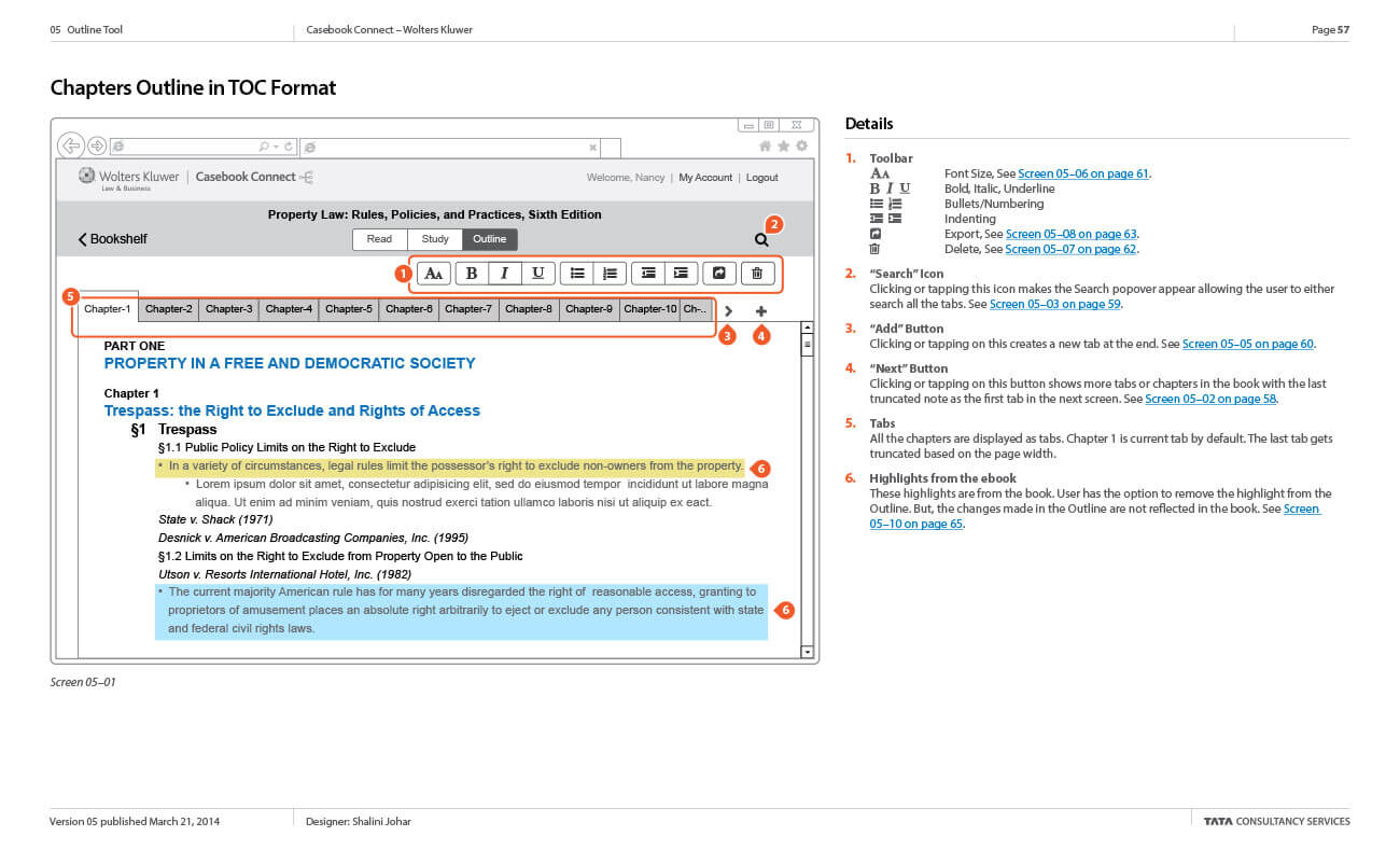
Outline
The outline tool pulls all the student's highlights and notes from the ebook into outline form using the casebook's table of contents for the initial outline structure. Students can then add more notes to the outline and even reorganize the outline structure if they wish. Once the outline is complete, students can print or export it to Microsoft Word.
Key Learnings & Takeaways
This project reinforced that great UX design isn’t just about features—it’s about identifying the real user pain points that drive value. By challenging assumptions and shifting focus based on research, we delivered an innovative solution that significantly enhanced legal education. This experience deepened my belief in user-centered innovation and cross-functional collaboration as key drivers of product success.
Results
- 54% reduction in time spent outlining casebooks, transcribing notes and case highlights, and searching for past notes and case highlights per semester.
- 21% improvement in study efficency.
- 24% increase in collaboration efficiency.
Final Product
Wolters Kluwer used their own in-house design staff for the visual design of the final product.