Reimagining Vanguard’s RMD Experience through Design Thinking
Overview
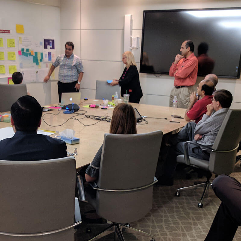
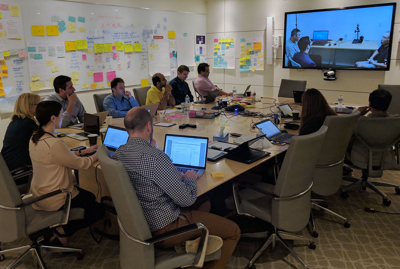
Vanguard partnered with TCS Digital Interactive to conduct a 4-day design thinking workshop focused on radically improving the Required Minimum Distribution (RMD) experience for retirement account holders. We reimagined how to balance business goals, reducing call volume and retaining assets while prioritizing a seamless, intuitive client experience.
Challenge
As clients approached their RMD age, Vanguard faced three intertwined challenges:
- Reducing call volume to call centers
- Retaining assets at Vanguard
- Improving client satisfaction and autonomy
However, attempts to simplify operations (like removing service options or reducing reminders) led to increased confusion, dissatisfaction (negative VOC), and missed RMDs, causing both business and client impacts.
Key Issues Identified:
- Fragmented experiences between Transfer Agent (TA) and Vanguard Brokerage Account (VBA) clients.
- Drop-offs during account upgrades
- Complicated manual processes requiring phone support
- Limited online tools, poor findability, inconsistent communication
Approach
Preparation
In the months leading up to the workshop:
- We conducted 5 video conference alignment sessions between TCS and Vanguard
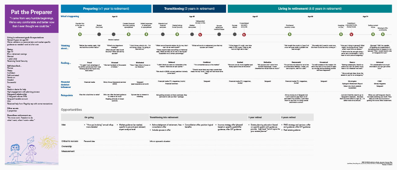
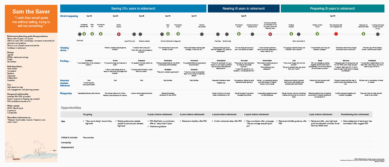
- Developed business goals, personas, and customer journey maps
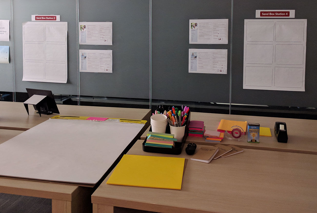
- Prepared sandbox scenarios and recruited six diverse retirement clients for user testing
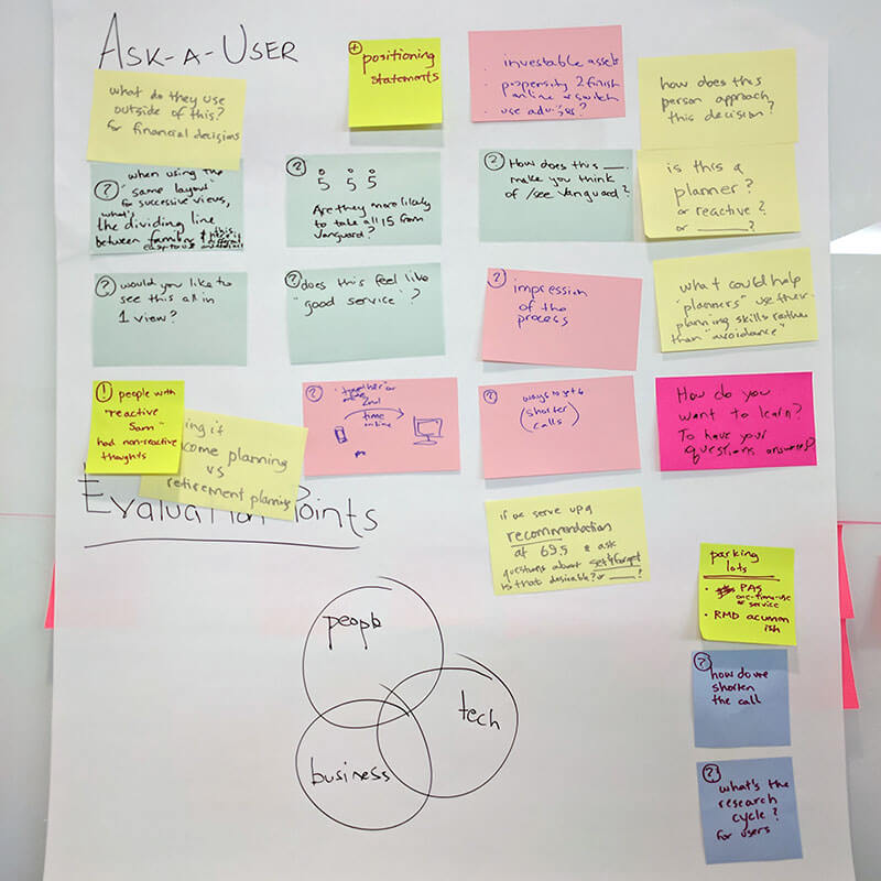
Workshop Process: 4 Days of Immersive Design Thinking
Day 1: Inspiration & Brainstorming
Sharing inspirations, team formations, persona and journey selection, ideation
Day 2: Synthesis & Prototyping
Distillation into two journeys (educational and active), rapid prototyping
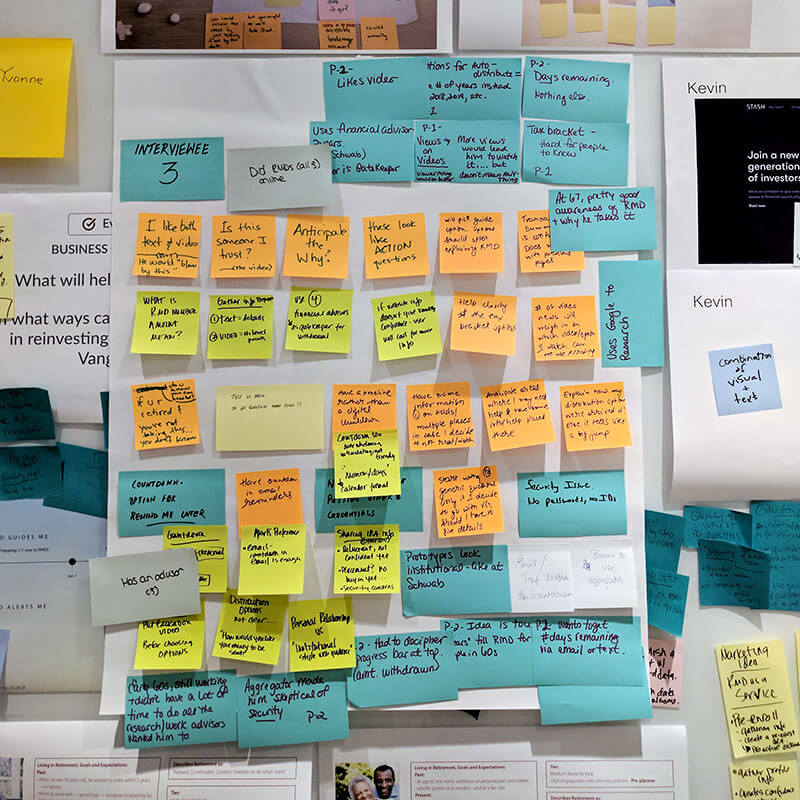
Day 3: User Testing
Real-time user testing with six clients; live observation and iteration
Day 4: Integration & Next Steps
Concept refinement, deliverables planning, and team process reflections
Solutions Designed
Pre-RMD Preparation (6 months to 1 year before deadline)
Goal: Educate, guide, and build confidence early to reduce last-minute calls.
Key Features:
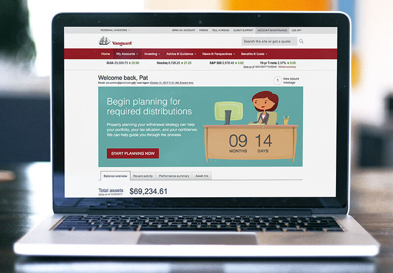
- Personalized Countdown Timer on the login screen
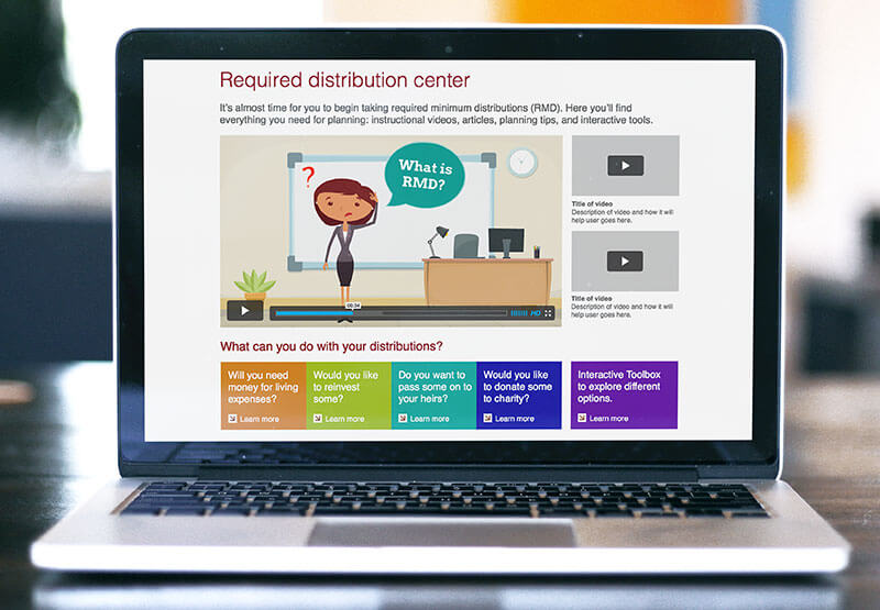
- RMD Hub: Centralized education center with videos, articles, interactive planning tools
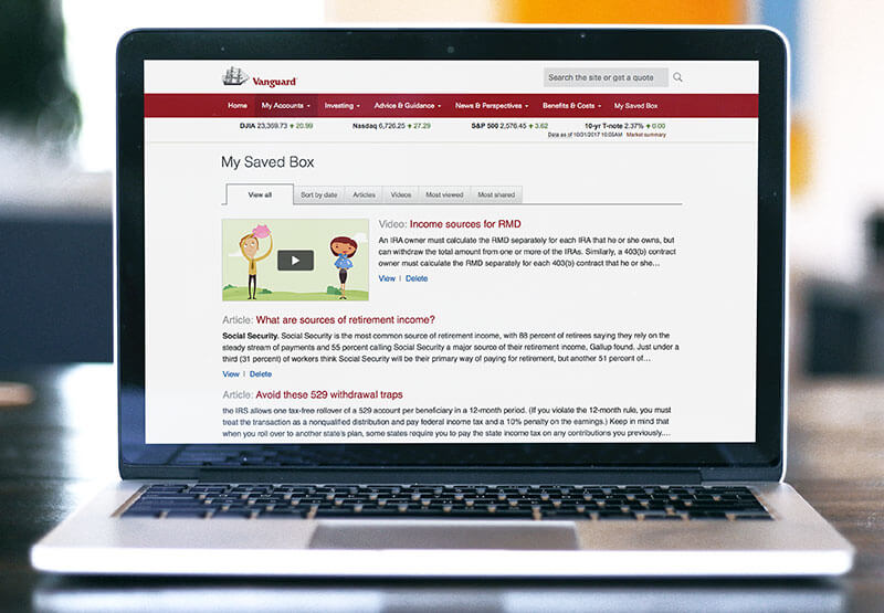
- SaveBox: Personal “folder” for users to save articles, calculations, and decisions
Taking the RMD (Action Phase)
Goal: Make the actual withdrawal process intuitive, error-free, and self-service friendly.
Key Features:
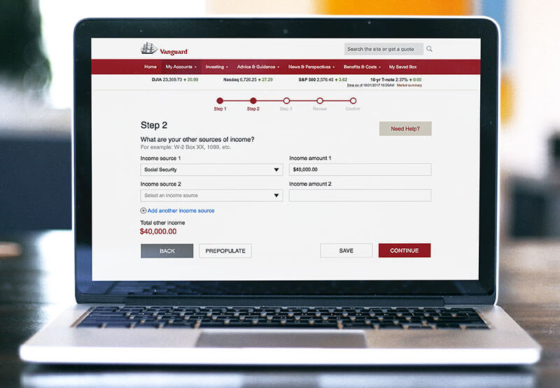
- Simple, progressive disclosure forms (step-by-step instead of overwhelming)
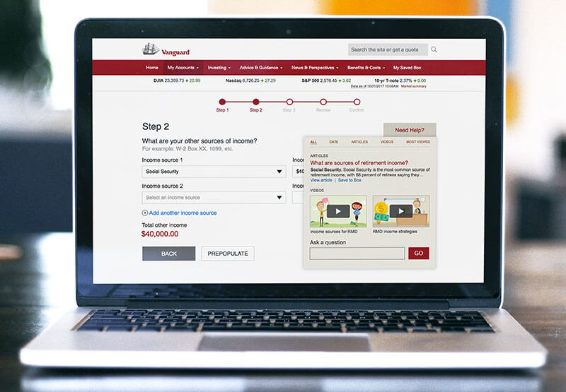
- In-line help overlays and tailored content
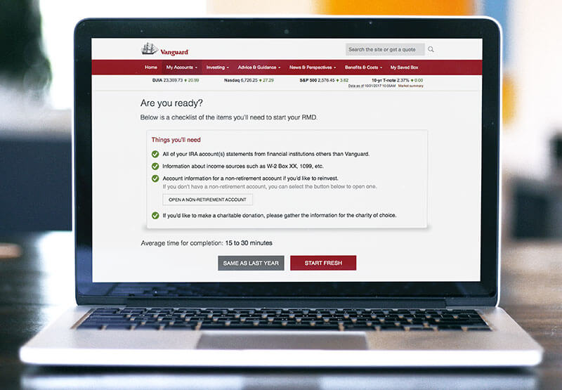
- Auto-fill options (“Same as Last Year” button) to minimize user input
- Guided vs. Self-Service Flows based on user comfort level
User Testing Insights
We validated the prototypes through direct observation and live interviews with six users across a wide age and tech-savviness spectrum.
Positive Findings
- Countdown reminders worked
Users loved having a clear, early heads-up; it made RMD feel manageable instead of last-minute. - Guided flows boosted confidence
A “Guide Me” option helped users feel less overwhelmed and more willing to complete tasks online. - In-line help made a real difference
Simple, easy-to-find help overlays gave users the confidence to move forward without picking up the phone. - SaveBox feature felt empowering
Saving articles, tools, and decisions in one place made users feel more in control of their planning. - Friendly language builds trust
A more conversational tone (instead of technical jargon) helped users feel like Vanguard was truly making the process easier.
Areas for Improvement
- Confusing terminology
Words like “Income Preference” threw people off. Clearer, plain-language labels like “Distribution Options” worked better. - Asking for too much too soon backfired
Asking for external account logins or sensitive data early in the process made users uncomfortable and more likely to bail out. - Users needed more context before taking action
Users wanted a quick overview or “what to expect” upfront before answering questions or making choices. - Visual cues weren’t always clear
Progress bars, buttons, and next steps sometimes got missed. Users needed stronger visual signposts to stay oriented. - Desire for flexible exploration
People didn’t always want to commit right away. They wanted the freedom to “learn more” without feeling locked into a decision.
Outcomes and Recommendations
Vanguard left the workshop with clear action plans:
- Launch a Countdown Reminder Campaign one year before RMD eligibility
- Build an RMD Education Hub with layered learning (beginner to advanced)
- Integrate Account Opening into RMD workflows to prevent disbursement errors
- Redesign Forms to be smarter, faster, and easier
- Train Representatives to support the new online-first flow
- Fix Navigational and Search Issues on Vanguard.com immediately
Longer-term strategic recommendations:
- Invest in TA flow modernization
- Prioritize user experience improvements even over pure call volume reduction
- Continue building self-service confidence over time, rather than focusing solely on immediate conversions
Reflections
This workshop demonstrated how client trust and ease of action must outweigh operational convenience when designing for retirement-age users.
By applying human-centered design principles, we built a roadmap not just for compliance, but for client empowerment, loyalty, and retention.