Transforming Math Assessment with UX & Data-Driven Design
Overview
A personal interview between a teacher and a student is at the heart of the Math Reasoning Inventory. Teachers initiate this process by registering for a complimentary account on the MRI website and signing in to access the tool. During the interview, positioned next to a student, the teacher poses specific questions expected by the Common Core for all middle schoolers to navigate successfully.
Most of the time, students are encouraged to solve problems mentally, with rare exceptions. Regardless of whether their solutions are correct, they must articulate their thought processes and strategies for solving each problem.
The role of the teacher is to provide students with ample thinking time, attentively listen to their explanations, and document their logical reasoning. This interaction shows students the essence of mathematical learning: the importance lies not just in arriving at the correct answers but also in reflecting on their thought processes and effectively communicating their reasoning.
Upon concluding the assessment, educators can generate, observe, store, and print instant reports highlighting students' reasoning abilities, knowledge, achievements, and areas needing improvement. These insights, applicable to individual students and the class collectively, guide teaching strategies and offer a deeper understanding of student capabilities and requirements.
Supporting the assessment, over 80 video segments showcase teachers employing the tool alongside introductory footage featuring Marilyn Burns. Burns explains the advantages of the Math Reasoning Inventory and the functionality of the tool to educators, aiming to enhance their understanding and application of this assessment method.
Problem Statement
Teachers didn’t just need to know if students got the right answer—they needed to understand how they solved problems to uncover gaps in reasoning and improve instruction. But existing assessment tools fell short—they were either too complex, lacked real-time insights, or failed to capture students' thought processes.
Without this critical information, educators struggled to personalize learning and teach better problem-solving strategies tailored to each student. MRI was created to bridge this gap, giving teachers a research-backed, easy-to-use tool that revealed how students think, so they could provide targeted support and drive stronger learning outcomes.
Key Challenges
- Non-Technical Users: Teachers and school admins had varying levels of tech proficiency, requiring a highly intuitive design.
- Guided Onboarding: Many teachers were new to online assessments, requiring clear instructions, logical flows, and informative empty states.
- Information Overload: Reports needed to present complex student data in an easy-to-digest format.
- Error Handling & Feedback: Errors needed to be easily understood and resolved, especially during student assessments.
Sign Up
Simplifying Onboarding for Non-Technical Users
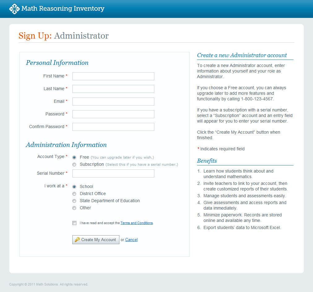
UX Challenge: Teachers and administrators had varying levels of technical proficiency, making onboarding a potential barrier to adoption. The process needed to be frictionless, intuitive, and accommodating of different user roles.
Solution: We designed a role-based sign-up flow that clearly differentiates between Teachers (who conduct assessments) and MRI Managers (who oversee group reporting). Instead of forcing users through complex setup steps upfront, we streamlined the process into a guided, step-by-step flow, reducing cognitive load and decision fatigue.
Why This Works:
- Reduces drop-off rates by keeping the sign-up flow simple and direct.
- Personalized onboarding ensures users see only the features relevant to their role.
Welcome Screen
Preventing User Confusion with Clear Onboarding Paths
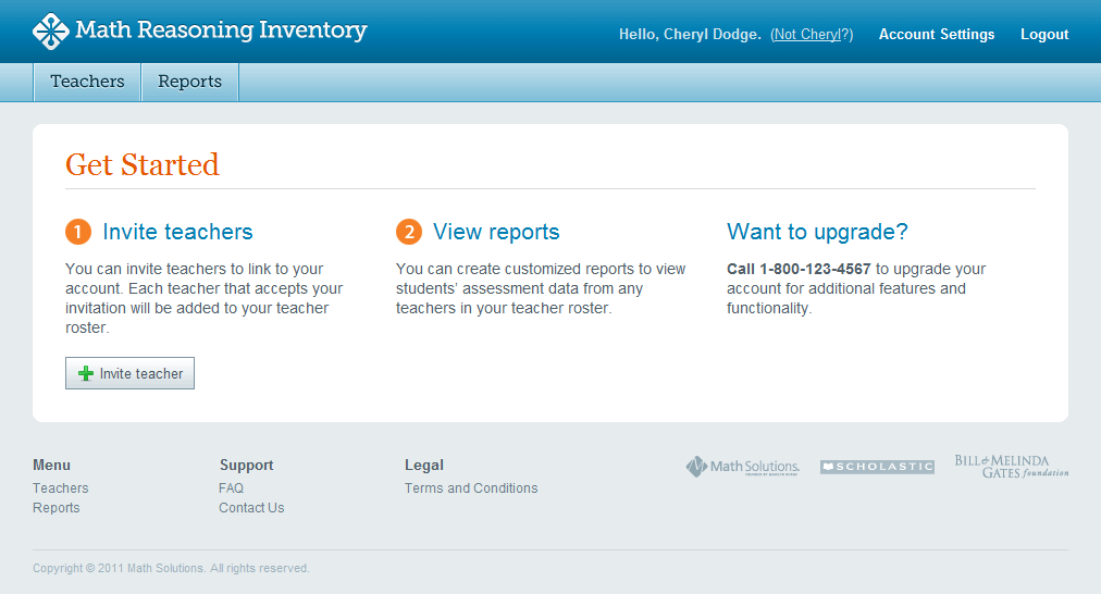
MRI Manager's Welcome Screen
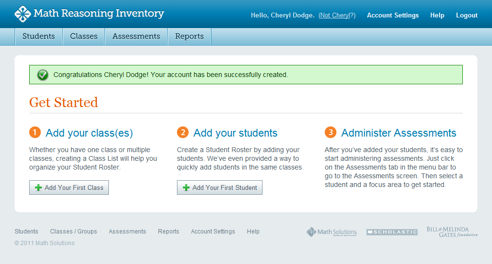
Teacher's Welcome Screen
UX Challenge: New users often struggle with blank screens that lack clear next steps. Without proper guidance, they would be unsure where to begin, leading to frustration or abandonment.
Solution: Instead of landing users on an empty dashboard, we created customized welcome screens for both Teachers and MRI Managers. Each welcome screen includes clear, action-oriented guidance, with call-to-action buttons explaining what to do next—whether it’s inviting teachers to join a group or adding classes and students.
Why This Works:
- Eliminates cognitive overload by reducing guesswork.
- Encourages first-time engagement by offering clear next steps.
MRI Manager
Inviting Teachers to Join Groups—Reducing Administrative Burden
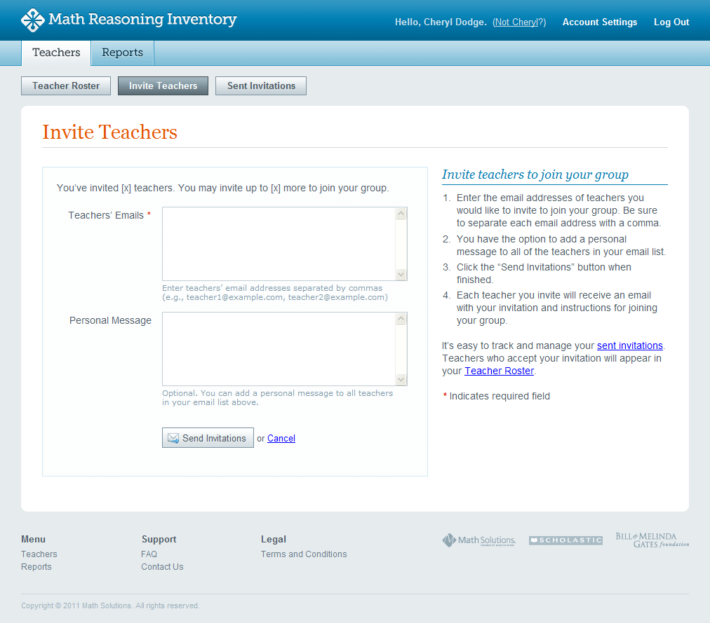
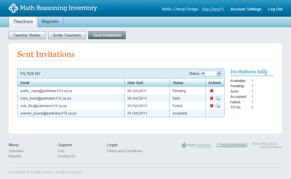
UX Challenge: MRI Managers needed an efficient way to onboard multiple teachers while ensuring seamless group reporting. Sending invitations manually was time-consuming, and users needed real-time visibility into invitation status.
Solution: We designed a bulk-invitation system where MRI Managers can simply enter a comma-separated list of emails and send invitations in one step. To provide transparency, we added a real-time invitation tracking panel, showing pending, sent, accepted, and failed invitations.
Why This Works:
- Speeds up administrative tasks, reducing time spent on manual onboarding.
- Improves user confidence by offering clear status updates and error handling.
Teacher Accepting Invitation
Reducing Friction for Existing Users
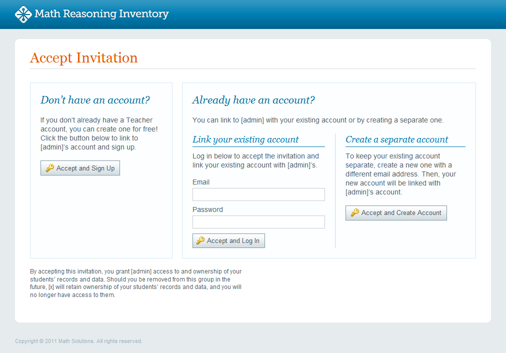
UX Challenge: Teachers who were invited to join MRI had different starting points—some had existing accounts, some didn’t, and others needed to link a different email. A confusing process would create unnecessary barriers to adoption.
Solution: Instead of a one-size-fits-all flow, we designed a dynamic invitation process that recognizes three key use cases:
- New users can quickly create an MRI account.
- Existing users can easily link the invitation to their current account.
- Users wanting a different email can create a new account while preserving the invitation.
Why This Works:
- Eliminates user frustration by addressing multiple entry points.
- Encourages higher completion rates by making the process flexible and seamless.
Teacher’s Student Assessment Interview
Streamlining Data Capture in a Live Setting
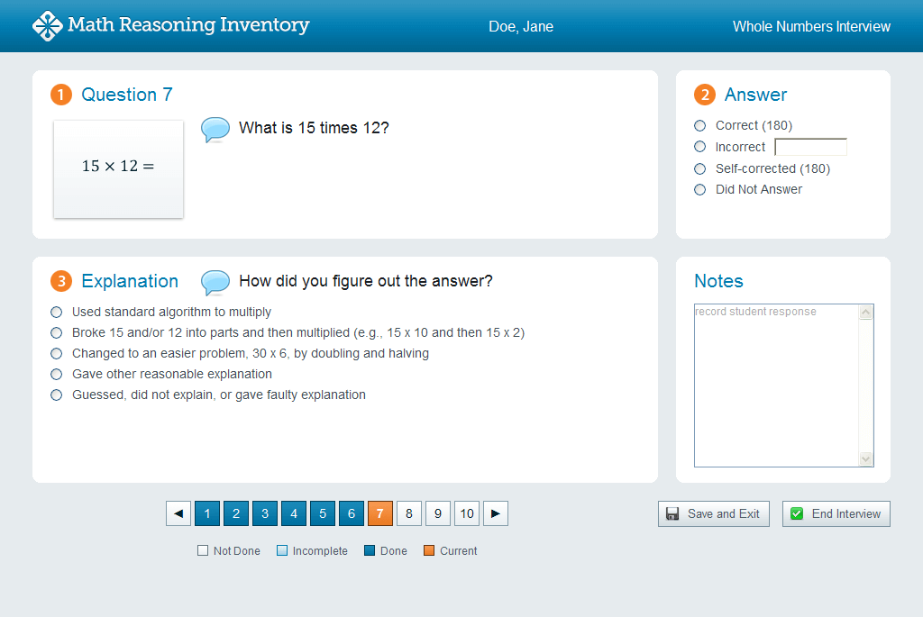
UX Challenge: During assessments, teachers needed a quick and intuitive way to record student responses without breaking the flow of conversation. The interface had to be uncluttered, structured, and responsive to real-time interactions.
Solution: We designed a clean, structured interface that mirrors the natural assessment process. Each screen displays:
- The current question with a visual thumbnail of the printed question card for quick reference.
- A dedicated area for recording student answers and problem-solving strategies.
- A pre-filled list of common strategies to reduce manual entry and speed up documentation.
Navigation is handled with color-coded pagination, allowing teachers to track progress and revisit previous responses effortlessly.
Why This Works:
- Minimizes disruptions by allowing teachers to focus on the student, not the interface.
- Reduces data entry effort with pre-filled strategy options and a quick and easy way to capture notes for each question.
Reports
Turning Raw Data into Actionable Insights
UX Challenge: Teachers needed easy-to-read reports that could quickly inform classroom instruction. Overly complex reports risked overwhelming educators with too much data, making insights hard to act on.
Solution: We designed a tiered reporting system with multiple views, ensuring teachers could get both high-level trends and deep dives into student performance. Reports were formatted for clarity and quick interpretation, with color-coded results and digestible summaries.
Why This Works:
- Helps teachers make informed decisions quickly without parsing through complex data.
- Encourages adoption by making reports visually intuitive and actionable.
Individual Report: Highlighting Key Strengths & Weaknesses at a Glance
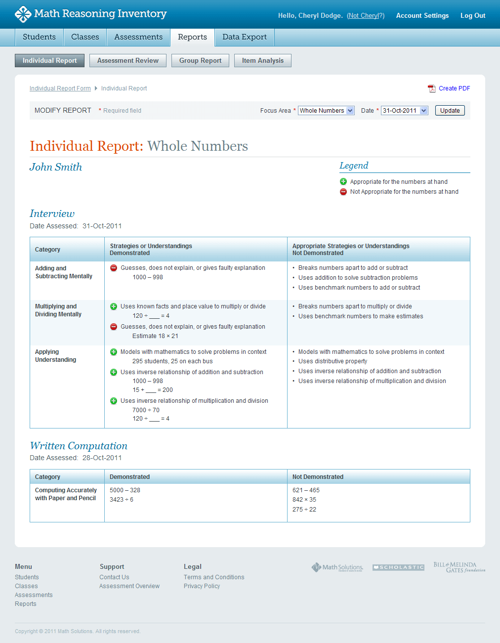
UX Challenge: Teachers needed to quickly understand a student’s problem-solving abilities without getting lost in unnecessary details.
Solution: The Individual Report presents a clear, visual summary of student performance, separating mastered concepts from struggling areas. Instead of just listing scores, the report highlights patterns in reasoning, helping teachers adjust their instruction accordingly.
Why This Works:
- Saves teachers time by surfacing only the most critical insights.
- Helps personalize learning by identifying specific areas for improvement.
Group Report: Identifying Classroom-Wide Learning Gaps
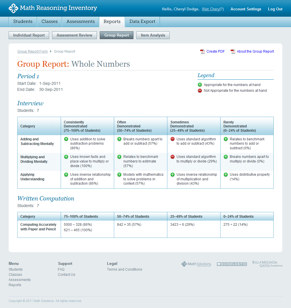
UX Challenge: Teachers needed a way to measure class performance at scale to determine which concepts needed more instruction.
Solution: We designed a percentage-based group report, which shows how many students answered each question correctly. This allows teachers to quickly pinpoint which concepts the class understands and which need reinforcement.
Why This Works:
- Provides actionable insights on where to focus additional instruction.
- Encourages data-driven teaching by visualizing learning gaps at scale.
Item Analysis Report: Helping Teachers Understand Why Students Struggle
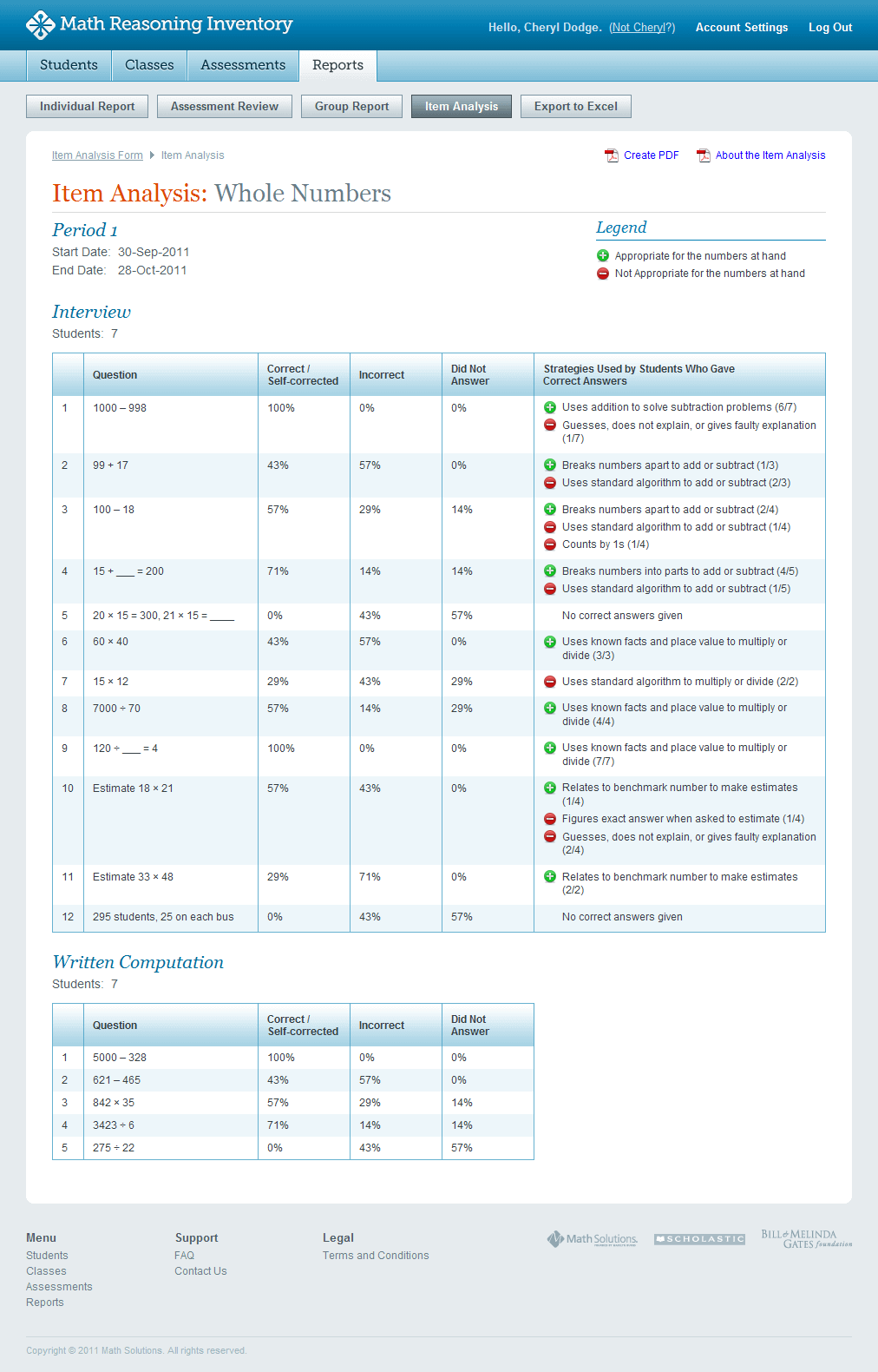
UX Challenge: Teachers needed to go beyond right and wrong answers and understand why students struggled with certain questions.
Solution: The Item Analysis Report breaks down:
- The percentage of students who answered correctly vs. incorrectly.
- The strategies used—and whether those strategies were appropriate.
Why This Works:
- Promotes deeper insights into student reasoning patterns..
- Helps refine teaching strategies by addressing misconceptions directly.
User Testing
At the beginning of the project, we performed user testing with 25 teachers nationwide who predominantly taught in K–6 schools and responded to the Trusted Teacher Survey. These teachers used the assessment tool with 180 students.
In the last phase of the project, 320 teachers interviewed over 9,600 students using the MRI tool. These teachers responded to a survey and gave feedback to evaluate the effectiveness of the MRI assessments and associated reports.
Users praised the design for its simplicity, clarity, and ease of use, highlighting its intuitive layout, minimal clutter, and user-friendly experience. Many appreciated the straightforward navigation and efficiency, making the tool both accessible and effective.
Results
-
Predicts Standardized Test Performance
- 85% correlation between MRI scores and SAT/PSAT results.
- Identifies at-risk students 6–12 months in advance.
-
Enhances Instructional Planning
- 100% of teachers in Hilliard City School District reported improved tracking of student growth.
- 30% increase in targeted interventions based on MRI data.
-
Boosts Student Achievement
- +25% growth in Quantile scores for students using MRI-driven Math 180 interventions.
- 40% of struggling students reached grade-level proficiency in one year.
-
Supports Standards-Based Grading
- 70% alignment between MRI results and classroom mastery in standards-based grading.
- More accurate placement in differentiated learning paths.
Lessons Learned & Leadership Takeaways
This project reinforced the importance of designing for non-technical users and validating assumptions through real-world testing. By focusing on intuitive workflows, progressive onboarding, and clear reporting, we were able to create a tool that not only improved student assessment but also empowered teachers with actionable insights.